That is mentioned in the new guidelines.
Ron
Samsung Developer Relations
That is mentioned in the new guidelines.
Ron
Samsung Developer Relations
Hi All, does anyone have any updates?
I’m doing some tests with icons but I still haven’t figured out what Google actually wants.
I get warnings even on simple screenshots gets from WFS (no logos, graphics etc …).
It would be great for Google to release a clear example of how they want icons for watch faces.
Since the “deadline” is August 31st, I think it would be good to receive some news (also) from this side.
Thanks !
The exterior is 512 pixels and the interior is 384 pixels. Just make it square.
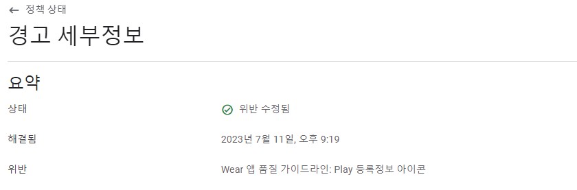
After doing this, I received a message from Google that the icon problem was resolved.
isaacok0919, thank you for the solution.
What is the reason for the size of 384 pixels inside?
I think it’s for aesthetic reasons. But a watch face isn’t an ordinary logo, so it’s odd that they don’t make a distinction here.
구글 스토어 아이콘 가이드 라인에 따른 픽셀입니다.
Pixels according to the Google Store Icon Guidelines.
오호 그렇군요. 답변 감사드려요 ^^
Create a 512 X 512 pixel square, with flat color such as white, and then paste your round watch face (384 X 384 px) on top of it.
If your watch face is using predominantly light color such as white, then better make the square background dark or black.
You can get same result with basically any image of watch face 450x450, with background or not. That’s why we need explanation / more info from Google.
Right now I have 5 watch faces with ‘Issue addressed’ messages all Icons with transparent background, 450x450 full circle watch face, and also graphic element inside.
Maybe 450 X 450 is too big, because that guide from Google definitely suggests 384 X 384 for the watch face dimension in the icon design, and 512 X 512 for the overall icon design. I did this and all of my watch face icons are approved.
I don’t see anything watch face icon size related. These two dimensions 512 and 384 (75%) are for regular app icons. It’s already hard to create some recognizable watch face icon. With only 75% the icon is so small. Even smaller on Wear OS Play Store. 384 applies for some graphics or logos of the apps. Approved =/ Good as you can get same result with just submitting same icon again.
The question is, will the Warning despair when we use the “new” icon layout (512 outside, 384 inside)?
Currently all kind of icons gets still approved, even with brand Logo. ![]()
The warnings are random. The rules are clear but impractical for watch faces.
Weird.
I think the only solution is for Google to update their “Google Play Icon Design Specifications” page (Google Play icon design specifications | Android Developers) with a CLEAR example of a watch face icon.
There are only generic App icons on that page.
I had one warning to the watch face icon - “Your app icon contains texts or graphics that are not part of the app experience”.
I uploaded a screenshot of the watch face 512x512 on a dark background.
Approximately 2 weeks later, I received a notification from Google that “Violation has been eliminated.”
The guide is pretty clear that you can’t have rounded edges on the Icon (the one that shows in the store) I don’t know if you can have an invisible Square background like WFS creates.
Ron
Samsung Developer Relations
Same with me.
After the Violation message. I have uploaded a new watch face icon round about 2 weeks ago:
Today i got the message that the violation was resolved.