Another major bug that will cause rejections for Android 16 themes….
The Samsung Calendar App developers are using a TEXT color from the GTS tool as a BACKGROUND color!
This applies to all devices on Android 16; Fold, Flip and S series.
The bug is due to using COMMON > COLOR > TEXT COLOR on COMMON > COLOR > POINT TEXT COLOR.
Samsung developers… when a color string says TEXT COLOR, please don’t use it as a background color.
To avoid this rejection for now, your Text color will need to be visible on your Point color. No, this is not visible in the tool.
There are now 30+ bugs I have identified and reported that you cannot see in the GTS Tool but will cause a rejection 
1 Like
Hello @Redacted
Sorry for the inconvenience.
Could you please report this issue via Seller Portal support team?
You can logging in to https://seller.samsungapps.com and go to Help > Contact Us
Thank you,
Jakia
Thank you.
I report all bugs and document them here so other theme sellers can avoid the rejection.
Fixing these bugs can take ages so it’s good to know about them.
For example, I reported the bug with the Find icon in January and seven months later it’s still not fixed.
1 Like
@Jakia.Sultana
Here is another bug from Samsung Calendar App. I’ve reported it to the seller office, but they say it’s not a bug. My reply email was returned as undeliverable, please pass it on to the dev teams.
Technically it’s not a bug in GTS, but rather a bug in Samsung Calendar app for using the wrong color parameters.
Common/ Controls/Buttons/ Button Background Color is designed be used for buttons, but Samsung Calendar app is using it for its side navigation panel background color. If that is intentional as stated in the seller office support reply, then the Calendar app should use the same element (Buttons) Common/ Controls/Button/ Text Color for its side navigation panel’s text color. But it doesn’t, it’s using Common/Color/Main Text Color instead.
Then there is Sub header divider color which is in Common/List/Sub header divider color. I don’t know where it pulls the color for the icon in the side navigation panel.
It is pulling color parameters from many different elements of GTS, and mixing them together. It can’t be using background color from one element, then using the text color from a different element and icon color from another element. This creates serious legibility issues, because colors of background and text of two different elements aren’t designed to be mixed.
1 Like
Hey John, in my testingI find these colors…
Am I missing the issue? 
In the tool, you can see on the 4th screen of Common > List where they are using the Button color as a BG.
1 Like
I’m referring the side menu, not the input field box.
- BG is from Common/ Controls/Buttons/ Button Background Color
- Text color is from Common/Color/Main Text Color
- Divider color is from Common/List/Sub header divider color
- Icon color I don’t know where it pulls the color from.
So the side menu is mixing colors parameter from at least four elements (Buttons, Color, List and unknown) that aren’t designed to be mixed.
2 Likes
Icons are Sub Title Text Color
The menu stripes are Primary.
The Settings icon on the expanded menu is Title Text Color.
So all those colors have to be visible on the Button Background.
1 Like
Hello @Redacted and @X9_Studio
Since you are facing issue in Samsung Calendar app, so we recommend you to report these issues via Samsung Members app.
Alternatively, you can also create a support ticket in Developer 1:1 Tech Support Channel. Please share issue reproduction steps and screenshots/videos with the support request.
Thank you,
Jakia
For legibility, a dark theme with a dark color BG uses a light color for Common/Color/Main Text Color. The same dark theme also needs the buttons BG to be a light color for the buttons to stand out, then Buttons text needs to use a dark color against the light color BG.
Now you mix the two elements’ color parameters together as the Calendar app side panel menu does. Apply that to the dark theme example above, light color Main Text Color against a light color Button BG equals a mess. Different element’s color parameters aren’t designed to mix, their color parameters are separated for reason. This can be avoided easily if the Calendar app uses one element’s color parameter instead of four or more.
1 Like
The side menu panel inconsistency color issue is with OneUI, rather than individual Samsung apps. Here the phone side menu is using another completely different set of colors.
My recommendation to the dev teams is either create a new element (side menu) with its own color parameters or just use the default white and black colors.
1 Like
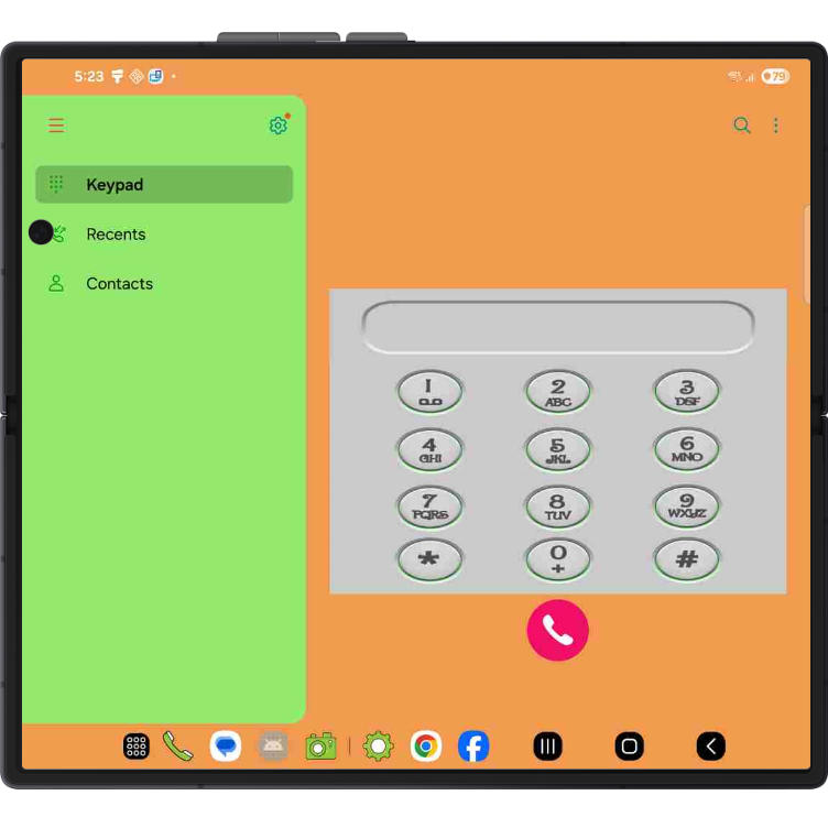
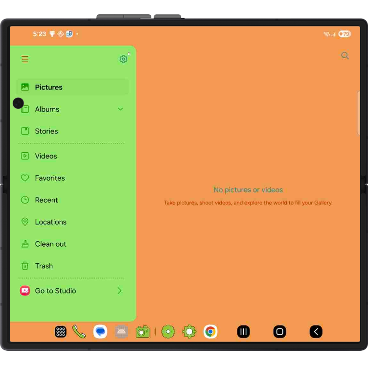
It’s confusing for sure, and not consistent… Take a look at My Files, their menu is completely different, white Gallery and Dialer are the same?
(attachments)
2 Likes